Whether you’re chasing golden hour on a summer hike or capturing moody forest shadows in the fall, knowing how to use color theory for photographers can add a deeper sense of intention and artistry to your images.
Let’s explore the 6 core types of color harmonies and how you can apply them in your photography to make your landscape pictures feel even more alive and visually rich.
I receive a small commission from links in this post, thank you for your support
Color Theory for Beginners
When I first started enjoying and experimenting with landscape photography, I thought color was just something I captured, not something I could use to shape a photo’s emotional impact with the viewer.
Over time, though, I started noticing how some images just felt more balanced and compelling than others to the eye, and some of that magic came down to color theory.
It’s not just for painters or graphic designers. Understanding how colors interact and the psychology of that interaction, is a game-changer behind the lens and in the digital darkroom.
What is the Color Theory of Photography
One of the most powerful tools in landscape photography is understanding how colors work together to create mood, emotion, and visual impact.
Color theory, a concept rooted in both art and science, is crucial when trying to create specific feelings through your photography.
Whether you’re capturing the golden light of dawn or the moody hues of an approaching storm, knowing how to use complementary, harmonious, and muted colors can transform your images.
📸Learn for free!
➡️ FREE Wallpapers and Guides
➡️ DISCOUNTS on future Tours & Tutorials
➡️ TIPS for improving Your photography

You can unsubscribe at anytime.
The Color Wheel : Best Visual Tool for Color Theory for Photographers

I love the color wheel I bought. It’s been a great addition to help me learn the different theories. Then I can apply them in the field and use the wheel itself while post-processing.
My Color Wheel, a bit worse for wear, pictured here.
What are the 6 types of Color Theory for Photographers?
- Analogous Colors
- Complementary Colors
- Triadic Colors
- Tetradic Colors
- Monochromatic Colors
- Split-Complementary Colors
Analogous Colors
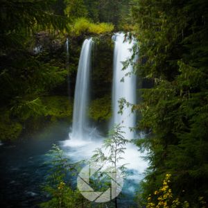
Analogous color schemes use three or more colors that sit side by side on the color wheel like yellow, yellow-green, and green. These colors are naturally harmonious and create a sense of visual cohesion, making them perfect for capturing peaceful, serene scenes with cohesive compositions.
Analogous colors are often found in nature. For example a meadow in early spring, where green grass transitions into yellow wildflowers, or a coastal scene where the blues of the ocean merge with the pale greens of the sky.
Think of the soft transition from golden grasses to sagebrush in a desert, or the blend of oranges, reds, and deep crimson during peak autumn.
When you’re photographing a landscape with subtle tonal shifts, an analogous palette helps amplify that quiet sense of connection in the environment and the four elements.
These compositions create a sense of tranquility and can be particularly useful for landscapes meant to convey peace or harmony.

3 Sisters in Fall, Canmore, Alberta
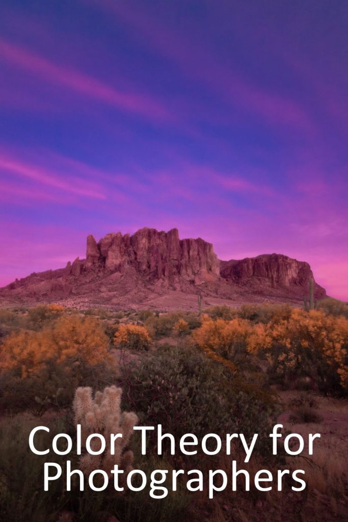
Complementary Colors
At the heart of color theory is the idea of complementary colors; those that sit opposite each other on the color wheel, such as blue and orange, red and green, or yellow and purple. When paired together, these colors create vibrant contrast that makes your compositions more dynamic and attention-grabbing.

Similarly, pairing the deep greens of a forest with the vibrant reds of fall foliage creates a stunning display of nature’s beauty, pulling the viewer’s eye towards key elements in your composition.
This color theory is why you would use a blu-ish foreground with a yellow/orange subject: the blue forces the viewers eye to engage with the yellow/orange (brighter) subject: the bluer part of the image fades into the background, leaving the brighter subject as the focal point.
Complementary colors naturally create contrast, but it’s important to use them carefully. Overpowering an image with too many complementary hues can create visual tension, overwhelming the viewer. The key is balance, allowing each color to play its role without competing for attention.
Triadic Colors
Triadic color schemes use three colors evenly spaced around the color wheel, such as red, yellow, and blue. They offer a vibrant, dynamic balance while still maintaining harmony.
In landscape photography, a triadic palette might appear in a wildflower-filled meadow: red poppies, golden daisies, and purple lupines. It’s a great tool for storytelling with color, especially when you want your photo to feel playful, energetic, or rich in variety without becoming chaotic.
Tetradic Colors

Tetradic color schemes (also called double-complementary) use two pairs of complementary colors; for example, blue and orange plus green and red. This combination allows for plenty of contrast and depth, but it requires a bit more thought to balance.
In outdoor scenes, you might use the warm hues of fall foliage (reds and oranges) against a blue sky and grassy meadow. When working with tetradic color, it helps to choose one dominant color and use the others more sparingly to prevent visual overload.
Monochromatic Colors
A monochromatic color scheme uses variations of a single color; different tones, shades, and tints of one hue. This is a favorite approach for minimalist photography or moody, atmospheric shots. Imagine a foggy morning in a pine forest, where every shade of green and gray-green builds a calm, introspective mood.
Monochromatic palettes help highlight textures, shapes, and patterns in a way that can feel deeply meditative and refined.

Split-Complementary Colors
Split-complementary schemes involve one base color plus the two colors adjacent to its complement, for instance, blue with yellow-orange and red-orange. It offers the contrast of complementary color but with a softer, more harmonious feel.
You’ll often find this naturally in coastal scenes, think of a cool blue ocean with golden sand and coral-orange rocks. This scheme adds emotional depth and a bit of tension without overwhelming the viewer, making it a great option for storytelling or emotionally rich compositions.

Color Theory for Photographers and Mastering Color for High Impact Storytelling
Do you capture images “in color” or do you capture images “of color”? Either way, understanding how color and contrast work together psychologically will impact your images and compositions.
Once you see your images the way your viewers see your images, your interpretation and presentation of the landscape may change.
The Weight of Colors: Understanding Visual Balance
Each color carries a certain visual “weight” that influences how viewers perceive balance in an image. In general, darker and more saturated colors feel heavier, while lighter, desaturated hues are perceived as lighter.
For example, a dark green tree against a pale blue sky will feel grounded and strong, while the sky will appear light and airy.
Balancing the weight of colors can be challenging but rewarding. A well-composed landscape should have harmony between heavy and light colors, ensuring that the viewer’s eye moves naturally across the frame without feeling lopsided or distracted.
Consider the balance of tones and colors carefully as you plan your shots, paying attention to how each hue interacts with the others.
The Power of Tone and Contrast in Color
Tone and contrast are essential when it comes to using color effectively in landscape photography. Tone refers to the lightness or darkness of a color, which directly affects how we perceive depth and mood.
For instance, dark tones like deep blues or purples can create mystery or melancholy, while lighter tones like soft yellows or greens create a sense of openness and tranquility.
Contrast, meanwhile, deals with the difference between colors or tones within a scene. High contrast like the stark juxtaposition between a bright orange sun and a deep blue sky creates a bold and energetic image.
Low contrast, on the other hand, uses softer transitions between colors, creating a more harmonious, peaceful feel. Knowing when to use high or low contrast helps you convey the right mood for your scene.
Advancing and Receding Colors: Creating Depth in Your Images
In landscape photography, certain colors are referred to as advancing or receding because of how they affect depth perception. Advancing colors such as warm reds, oranges, and yellows, tend to feel closer and more immediate to the viewer.
These colors create a sense of energy and can be used to make the foreground of your image stand out.
Receding colors, like blues, greens, and purples, appear to pull away, creating a sense of depth. Cool tones often represent distance, such as the fading hues of a mountain range in the background.
By understanding how colors advance or recede, you can manipulate the viewer’s perception of space and create more dynamic, three-dimensional landscapes.
For example, a photograph of a mountain scene may use a bright red wildflower in the foreground to “pop” against the cooler blue tones of the distant sky and mountains, creating a sense of depth and scale.
Warm and Cool Colors: Balancing Energy and Calm
Color temperature plays a crucial role in setting the emotional tone of your landscape images. Warm colors (reds, oranges, and yellows) are often associated with warmth, energy, and passion.
Think of a fiery sunrise, where the warmth of the sun bathes the landscape in golden light. Warm tones create a sense of comfort and vitality.
On the other hand, cool colors (blues, greens, and purples) tend to create a calm, serenity, and reflection type of mood. Cool tones are perfect for capturing tranquil lakes, shadowed forests, or misty mountain ranges. These hues create a sense of quietude and often encourage the viewer to feel more introspective.
Balancing warm and cool colors in your landscapes allows you to guide the viewer’s emotional response. For example, you might use warm light on a foreground subject to draw attention and then balance it with cool tones in the background to create a feeling of peace or stillness.
Muted Colors: Subtle Beauty in Simplicity
In some landscapes, muted colors (those that are less saturated or vibrant) can be as impactful as bold, bright hues.
Muted colors, such as the soft grays of a foggy morning or the faded browns of a desert landscape, can invite subtle emotions and add a sense of timelessness to your photos.
Muted tones are especially effective in minimalist compositions, where less is more. By focusing on understated color palettes, you allow the viewer to appreciate the texture, light, and form of the scene without being distracted by vivid colors.
This technique is often used in fine art photography to create a sense of contemplation or quiet beauty.
Conclusion
Understanding the relationships between the 6 types of color theory for photographers allows you to compose more powerful landscape images. By carefully balancing tone, contrast, and the weight of colors, you can create specific emotions and guide your viewer’s experience.
Whether you’re using warm tones to create energy or cool tones to create peace, mastering color theory in landscape photography is key to creating images that resonate on a deeper level.
📸Learn for free!
➡️ FREE Wallpapers and Guides
➡️ DISCOUNTS on future Tours & Tutorials
➡️ TIPS for improving Your photography
You can unsubscribe at anytime.
- Color Theory for Beginners
- What is the Color Theory of Photography
- The Color Wheel : Best Visual Tool for Color Theory for Photographers
- What are the 6 types of Color Theory for Photographers?
- Analogous Colors
- Complementary Colors
- Triadic Colors
- Tetradic Colors
- Monochromatic Colors
- Split-Complementary Colors
- Color Theory for Photographers and Mastering Color for High Impact Storytelling
- The Weight of Colors: Understanding Visual Balance
- The Power of Tone and Contrast in Color
- Advancing and Receding Colors: Creating Depth in Your Images
- Warm and Cool Colors: Balancing Energy and Calm
- Muted Colors: Subtle Beauty in Simplicity
- Conclusion
- References
- 📸Learn for free!
- 📸Learn for free!